
Layout 23 - Picture In Word Layout

-
-
Coming Soon
Step 1: Create the Document
Open InDesign and create a new document.
Set the dimensions to 8.5" x 11", portrait orientation, two pages, facing pages checked.
Set margins to 0.625" and the bleed to 0.125".
Step 2: Choose and Anchor the Image
Select an image that has a strong subject and background contrast.
I suggest everybody to take a look at complementary color pickers like Adobe Color and pick images accordingly.
Instead of using the rectangular frame tool, use the Pen Tool (P) to create a custom-shaped frame.
Click where you want the frame and shape it as desired.
Remember that the lesser amount of anchor points you have, the smoother your curve will be!
Adjust the anchor points using the Direct Selection Tool (A).
Alternatively, you can smooth the curve by using the smooth tool, which will appear if you right click on the Pencil Tool (N).
Drag your image into the custom frame from your file explorer.

Step 3: Adjust the Image within the Frame
Ensure the image fills the entire page.
See Image below - you want the brown line to at least occupy or even expand past the boundary of your page.
Double-click into the frame and adjust the image size by dragging the frame boundaries.
Remove any colored outlines or colored fill by setting the stroke/fill to “none”.

Make sure your image is bigger than the page itself.
Step 4: Add Text Overlay
Use the Type Tool (T) to add text over the image (e.g., "Why Settle for Less").
Choose a bold or black font so the text is thick enough to interact with the image.
The bolder your font, the more image will show up.
Create outlines of the text, go to “Type > Create Outlines” with your text selected.
Ungroup the text (right-click and select “Ungroup”), then adjust letter spacing.
Convert the text to a compound path (Object > Path > Make Compound Path).
This will make it so that all the text together will function as a single frame rather than each letter being its own frame.
Step 5: Insert the Image into Text
Copy the image from the previous step.
Make sure you double click into the frame of the big picture before you hit copy!
Select the outlined text and paste the image into the text frame (right-click > Paste Into).
Adjust the size of the text frame to fit your design.
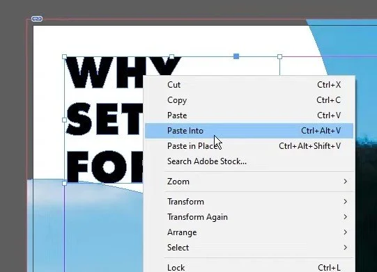
Pasting big image into the smaller text.
Step 6: Add an Additional Image on the Opposite Side
Use AI-generated tools (like apob.ai) to create a complementary image if necessary.
If not needed, feel free to utilize an existing image that works!
Download and import the new image into InDesign using the Ellipse Frame Tool (L) for a circular frame.
Fit the image proportionally within the frame. (Right click > Fitting > Fit Frame Proportionally)
Step 7: Finalize the Text Design
Duplicate the first text frame and adjust the content for the other side.
Follow the same steps to convert the text to outlines, create a compound path, and insert the new image.
Adjust the image and text to ensure consistency across the layout.
Step 8: Populate with the Text you want
Use the Type Tool (T) to create text boxes and fill them with placeholder text.
Adjust the text frame options to split the text into two columns.
You can do this by right clicking the text frame and selecting “Text Frame Options”.
Use Arial Regular or another simple font at 10-point size for readability.

Step 9: Add a Quote with Text Wrap
Create a new text box for a quote or highlighted text with the text tool (T).
Use text wrap options (Window > Text Wrap) to wrap the text around the box.
Here I use the “Jump Object” wrap option.
Set a small inset spacing (e.g., 0.1875) to give the text some breathing room.

Step 10: Apply Finishing Effects
To give the design a soft, angelic look, go to “Window > Effects” and add an Inner Glow effect to the text.
Add a Basic Feather to soften the edges of the text for a subtle, glowing effect.

And that’s it! This is one of those things that I believe anybody working in InDesign should know about, let me know how this worked for you.