
2 Grid Layouts that Made me a Pro

-
-
Coming Soon
Okay guys, this one seriously helped me out so much as soon as I found out about utilizing them to their full potential, follow along cuz this one is a GEM.
A reminder that this will work for US Letter sized paper as well as A4.
1. Set Up Your Document in InDesign
Open Adobe InDesign and create a new document.
Here are using facing letter (8.5” x 11”) pages but it will also work with A4 formats.
If you would like Grids to show up on every page. Make sure to create them on your Parent Pages!
Grid #1: The 5x7 Grid
Navigate to Layout > Create Guides.
Set Rows to 7 and Columns to 5.
This matches the longer dimension with the bigger number (7), and the shorter dimension with the smaller number (5).
Adjust the Gutter: Lower the gutter value so that text and images sit closer together, enhancing their relationship on the page.
Decide whether to fit the guides to the Margins or the Page:
Fit to Margins: Offers more white space, creating a clean, modern look with a balanced and easy text-image alignment.
Fit to Page: Makes full-bleed images stand out and organizes content across the entire page. Best for layouts with large images.
Layout Considerations for 5x7 Grid
Centering: This grid isn't ideal for centered elements or layouts with evenly spaced elements, as the 5 columns make centering difficult.
Strengths: Excellent for creating hierarchy, balancing white space, and accommodating portrait or landscape images.
Adjusting Images: As you adjust elements, larger images will become even larger, while smaller ones will shrink—highlighting the importance of grid-based scaling.
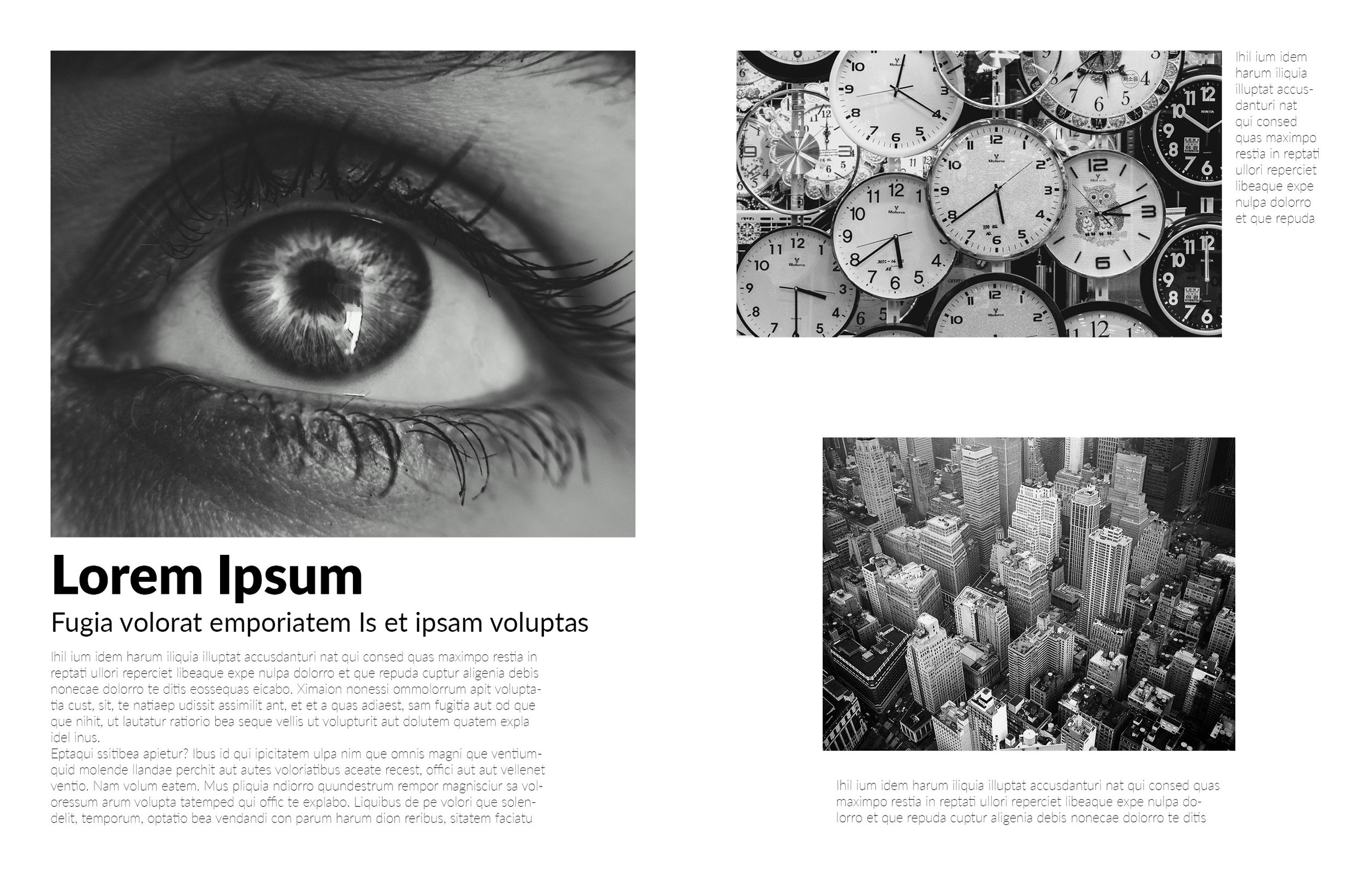
Breaking the Grid
If the grid doesn’t suit your layout, you can break it. The 5x7 is great for breaking the grid since elements aren’t mirrored and doesn’t have to follow a rigid placement.
For instance, when placing text in an area that doesn’t fit the grid, create a text box outside the grid, and position it freely.
In the example, I created a text box that breaks the grid, but was still in the middle of 9 grid elements.

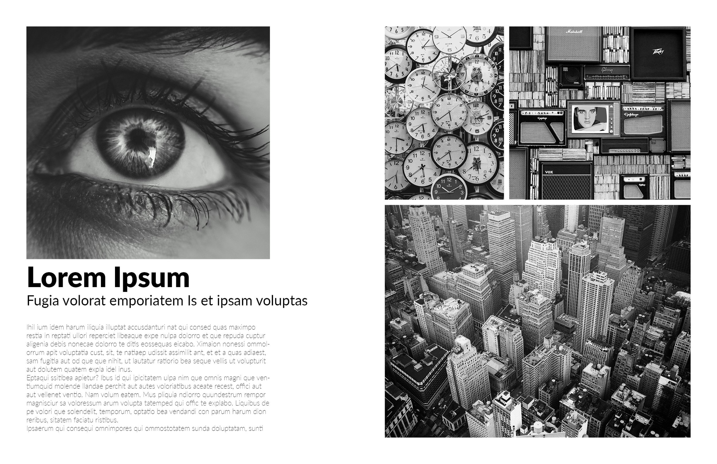
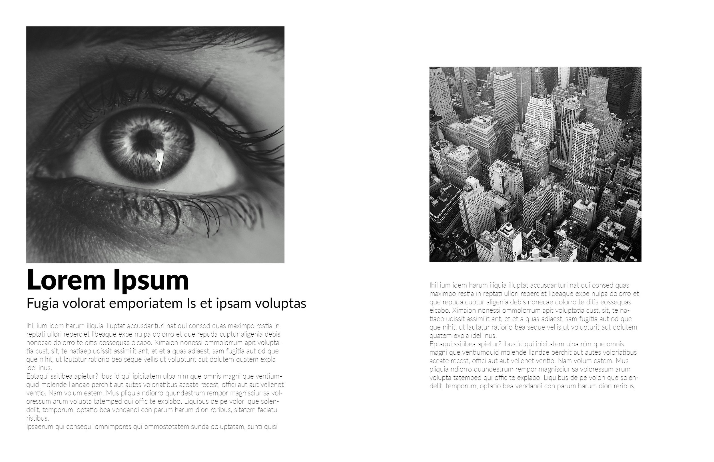
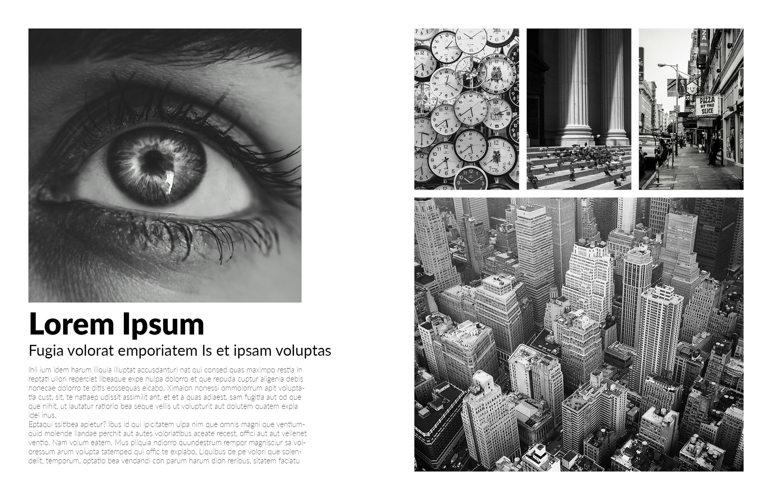
5x7 Layout Showcase
Grid #2: The 6x8 Grid
Go to Layout > Create Guides again.
Set Rows to 8 and Columns to 6.
Keep the gutter unchanged to maintain spacing between elements, especially when you have more blocks.
Use this grid for layouts that demand **more order** and **consistency**, perfect for image series or collages.
Similar to the 5x7 grid, you can fit this grid either to the margins or the page.
Fit to Margins**: Creates a neat, orderly look with well-spaced elements.
Fit to Page**: Better for full-bleed images, where all elements fit seamlessly onto the page.
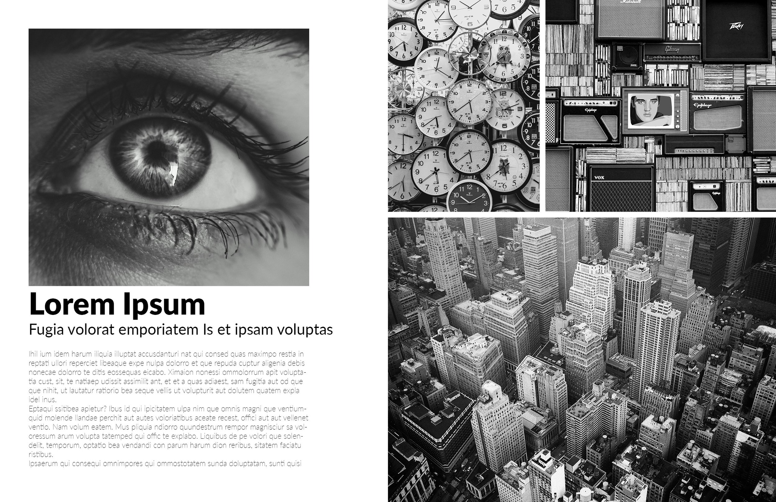
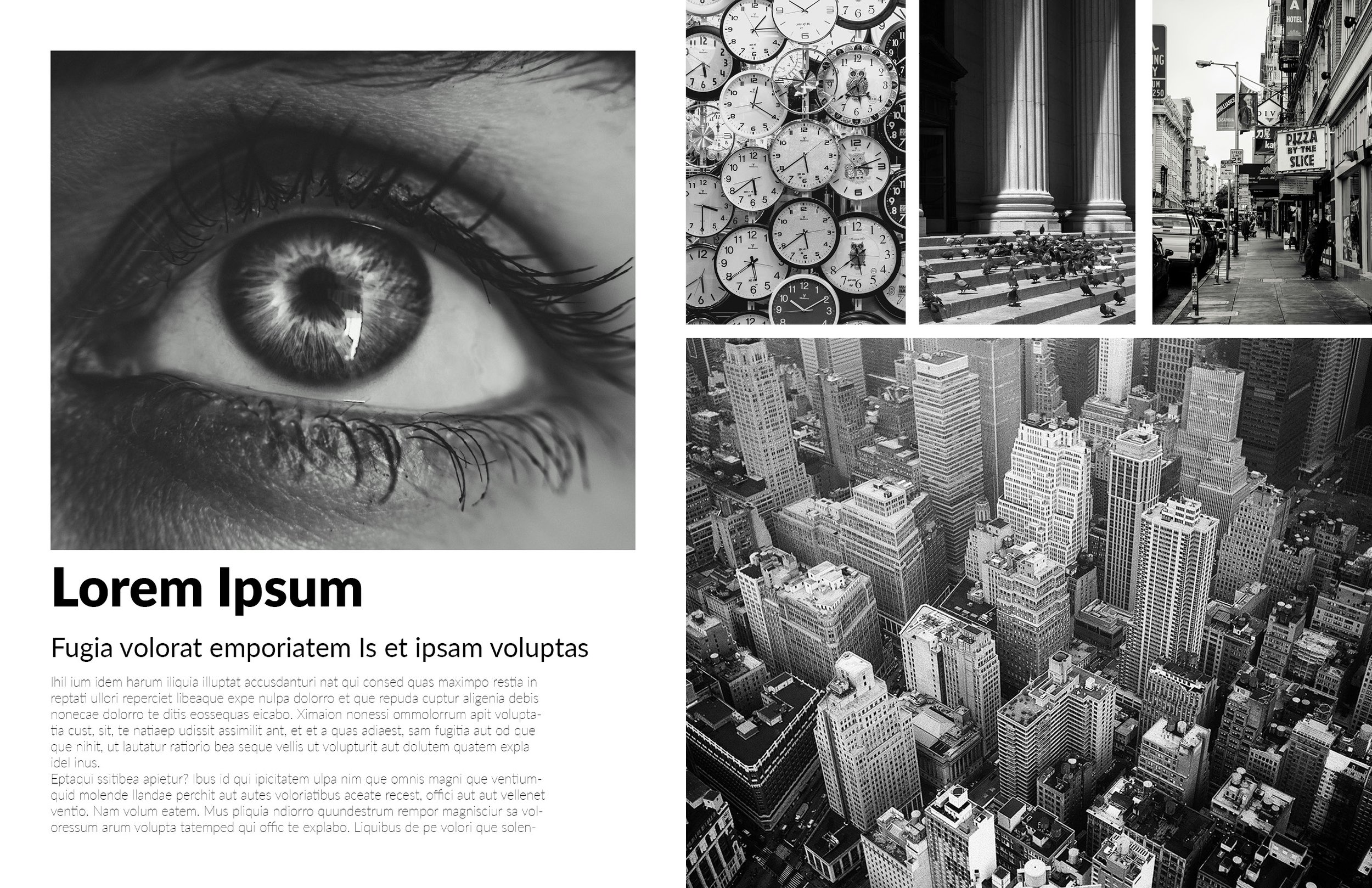
6 x 8 Layout Showcase
Grid Comparison, which one should I use?
5x7 Grid:
Best for creating clean, modern layouts with clear hierarchy.
Align to margins for more white space and structure.
6x8 Grid:
Ideal for organizing content consistently, especially for image-heavy layouts.
Align to page for full-bleed layouts or series of images.
Final Tips
Always preview and compare grids before finalizing your layout.
Breaking the grid is fine but should be done intentionally.
Grids help ensure clean, professional-looking designs—use them to your advantage!
Share with me your results, would love to see them!