Layout 26 - Abstract Cutouts
-
-
Coming Soon
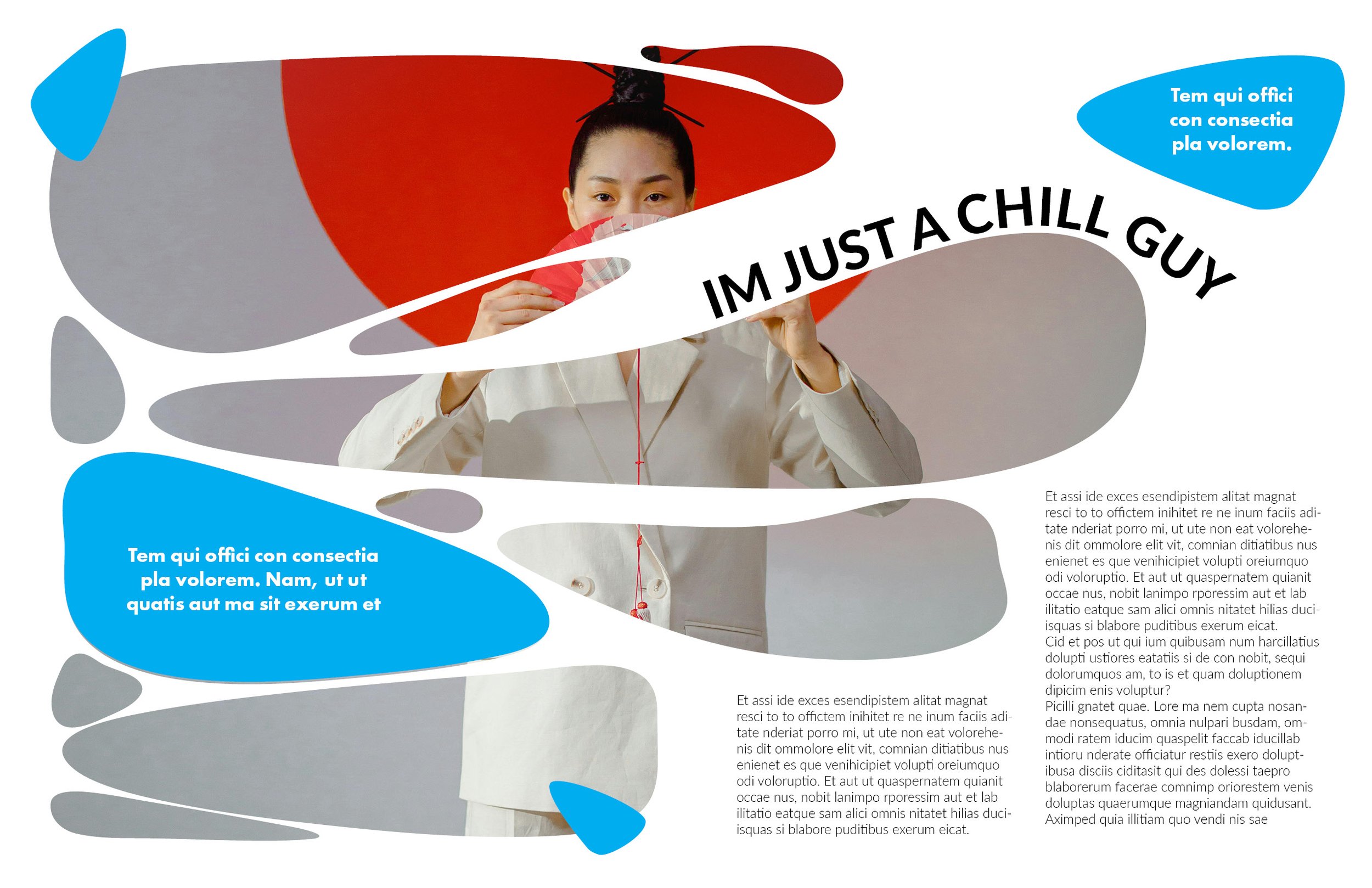
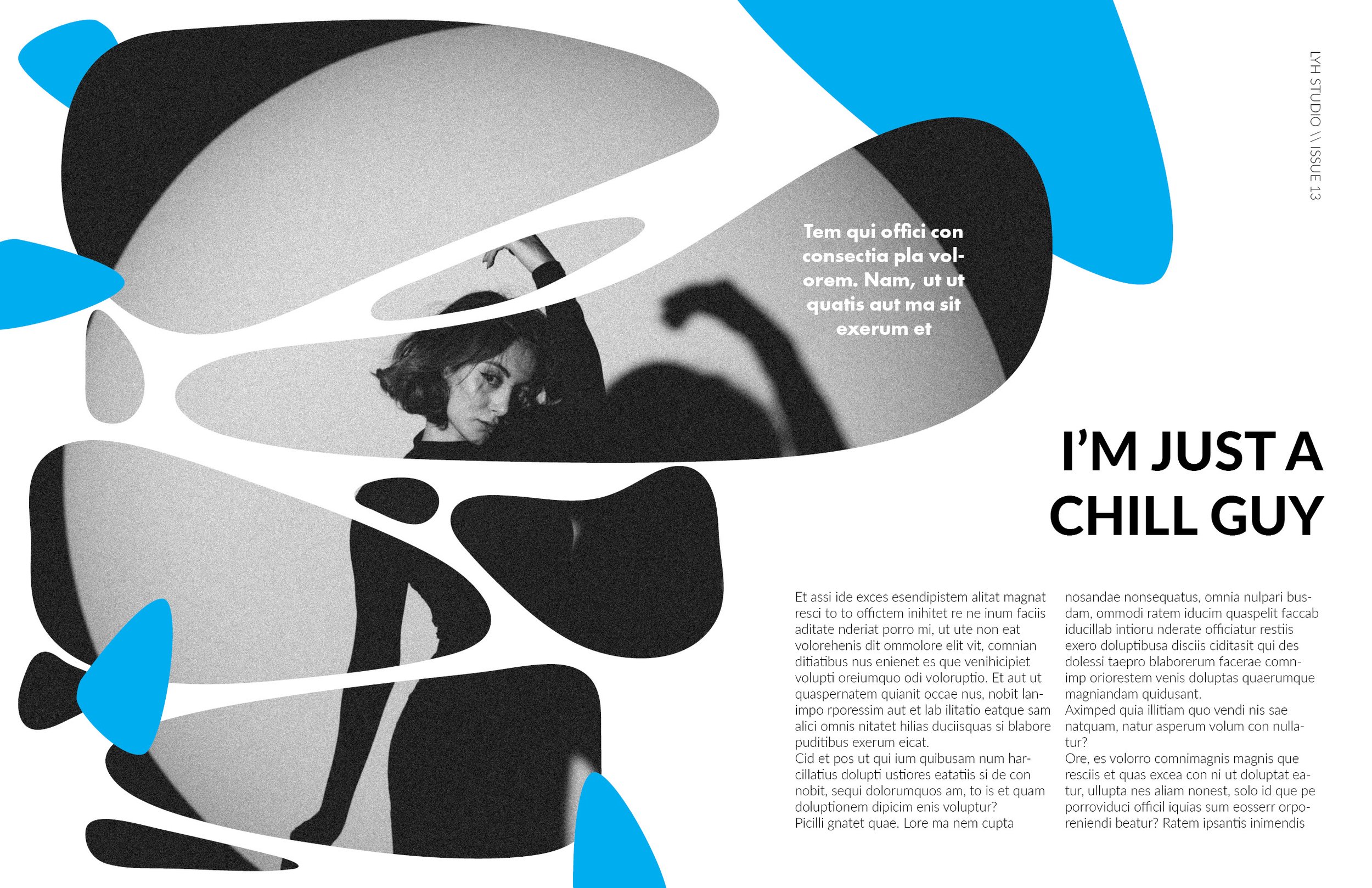
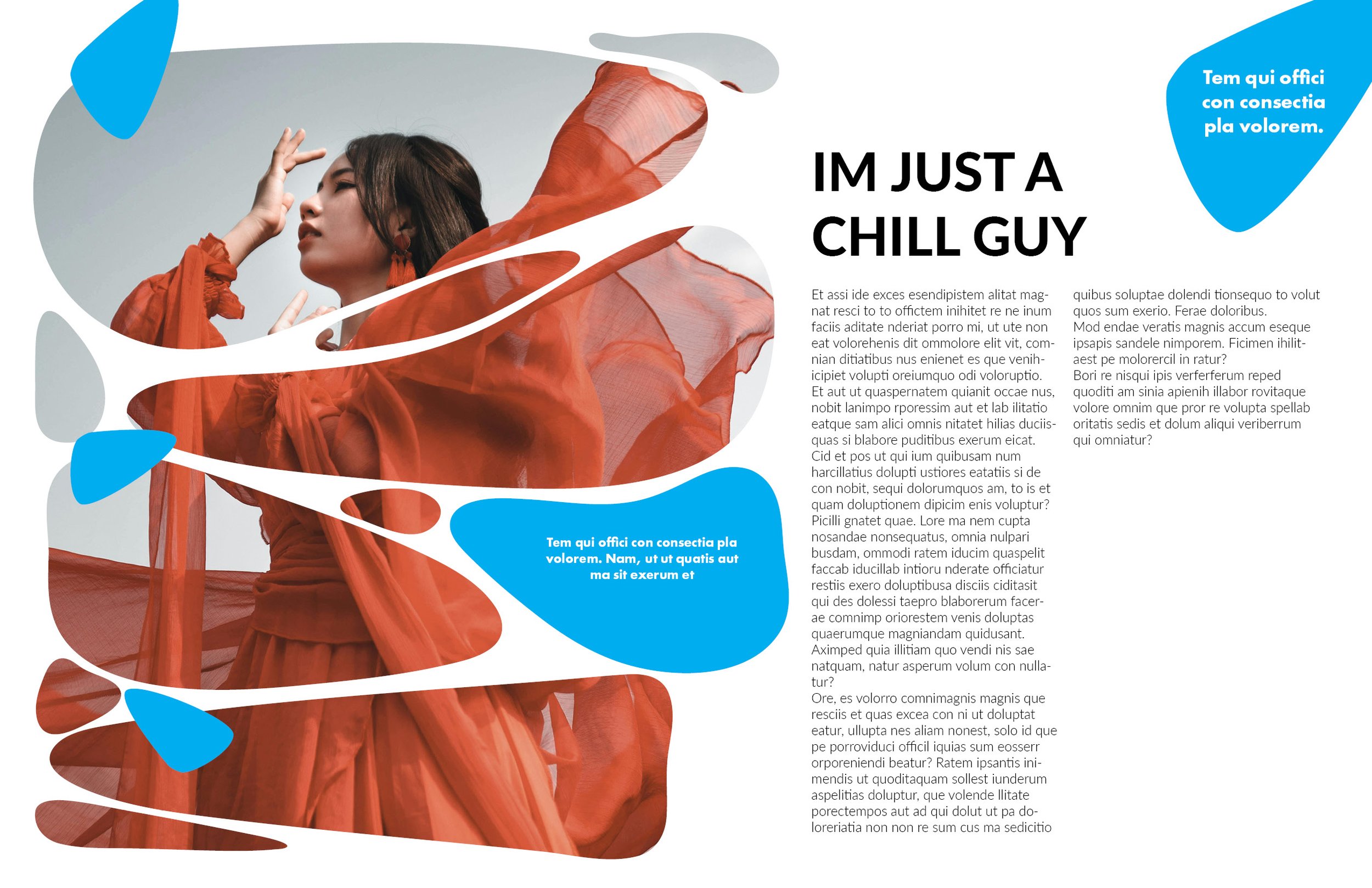
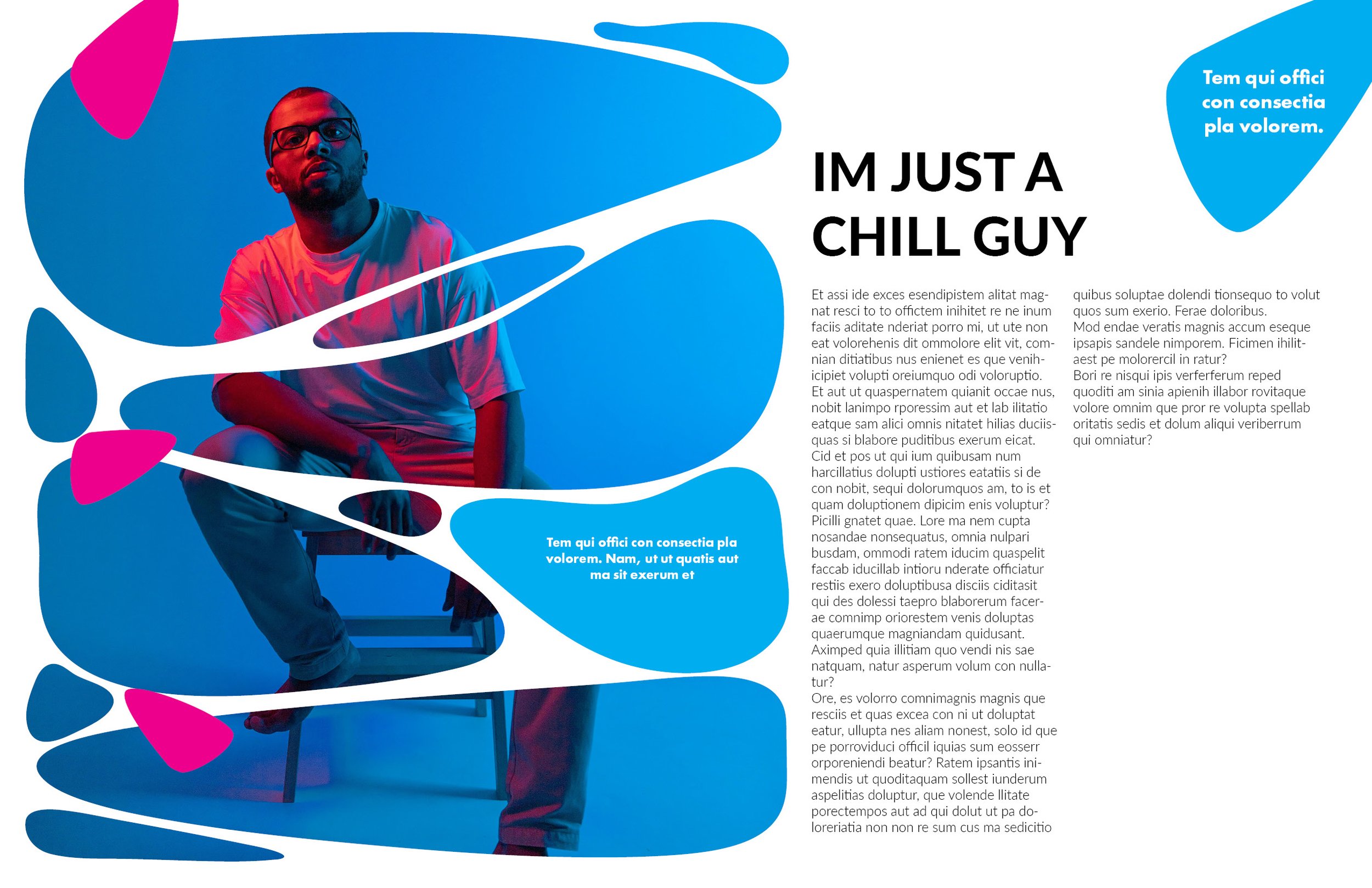
As Promised, here are the 10 iterations that got me to where this layout ended up. Let me know which one is your favorite!
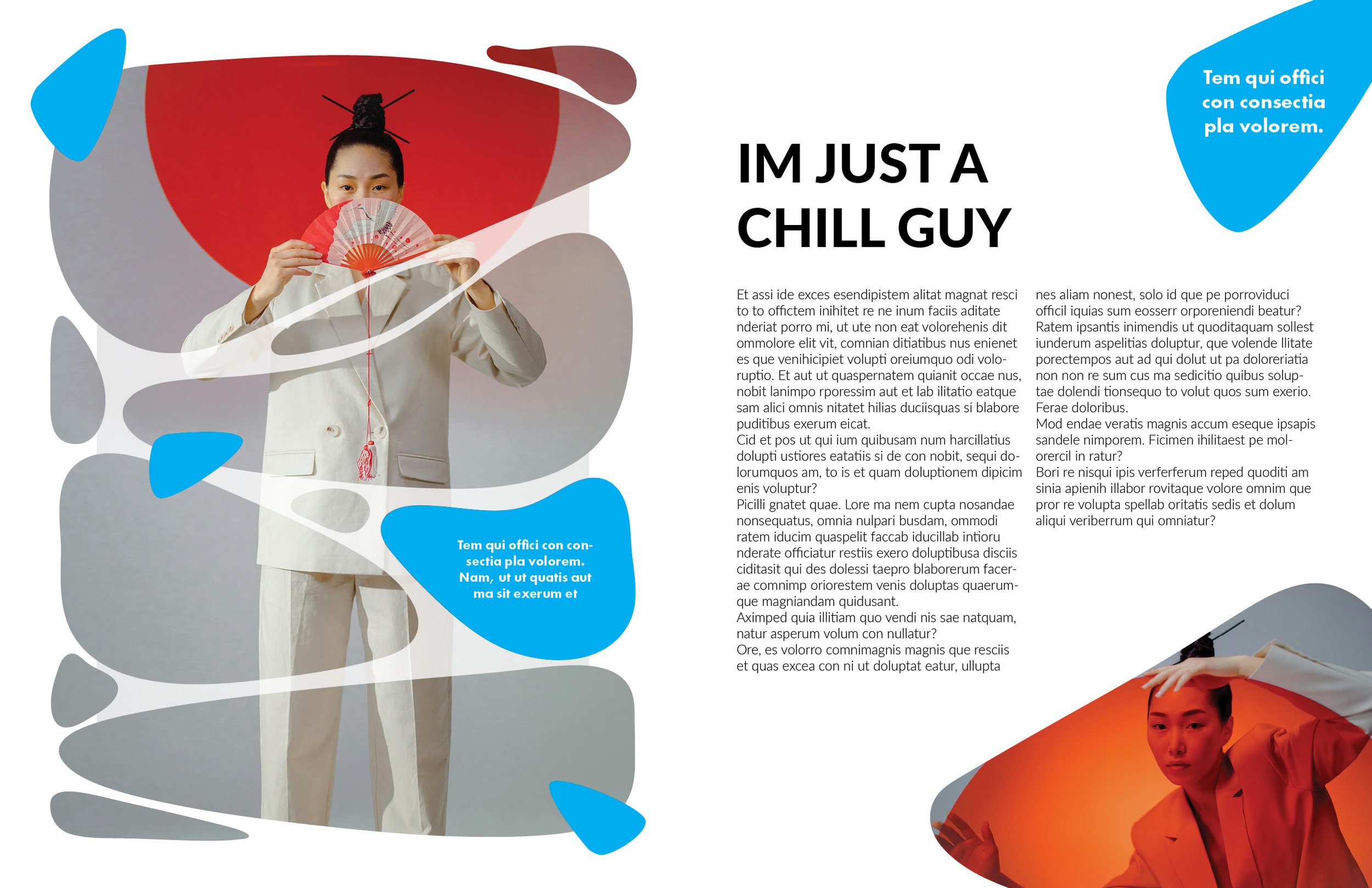
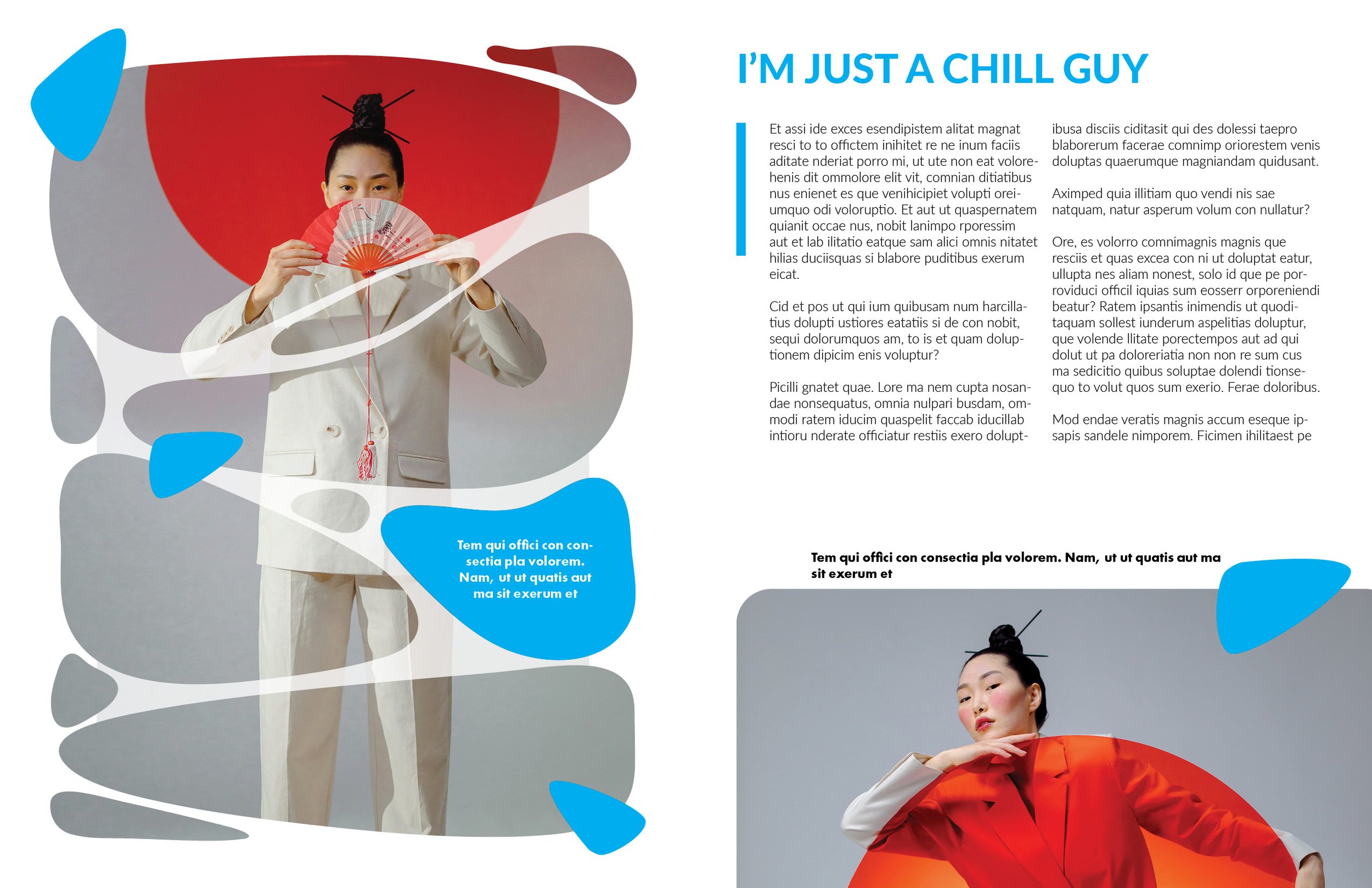
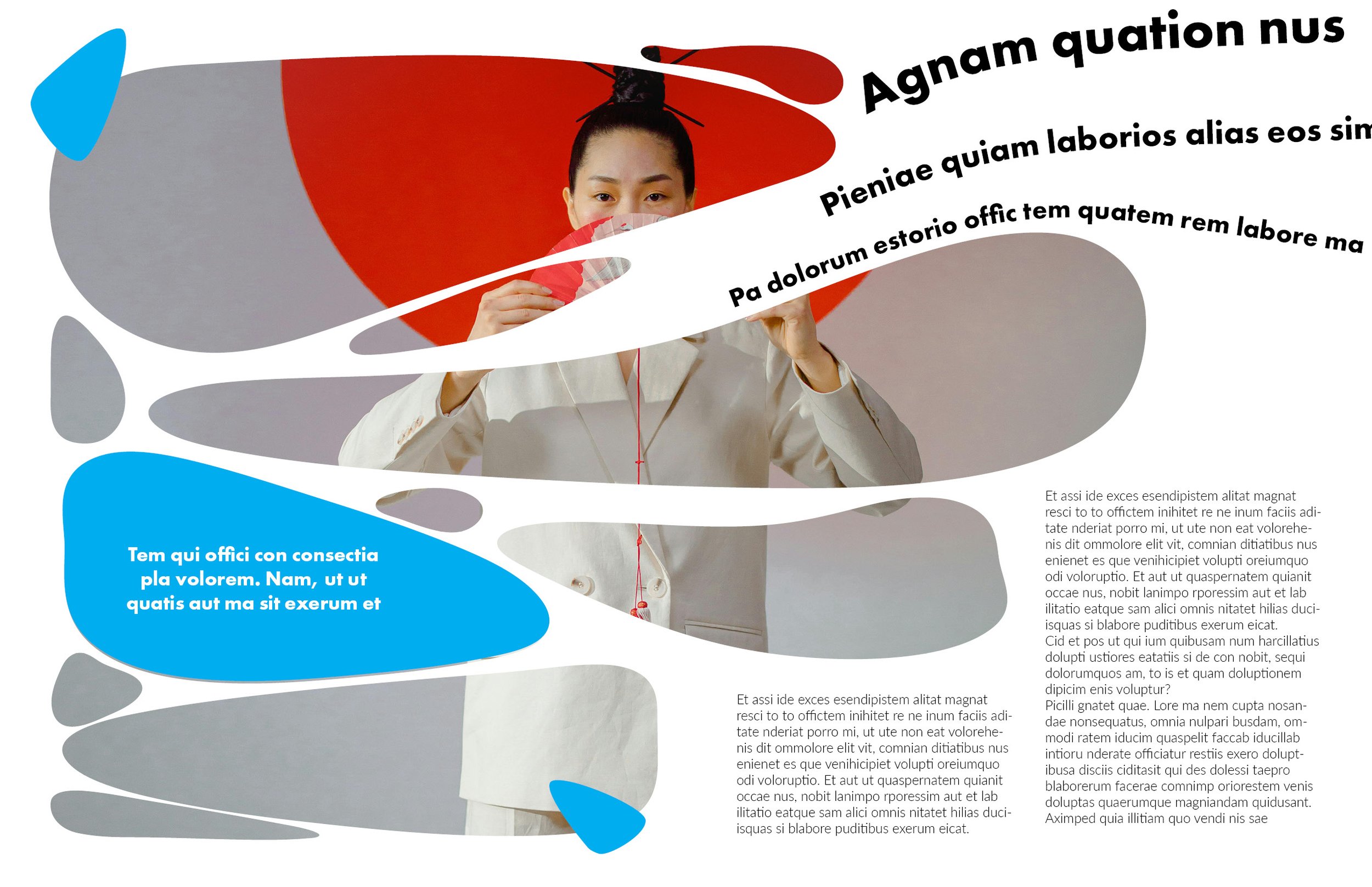
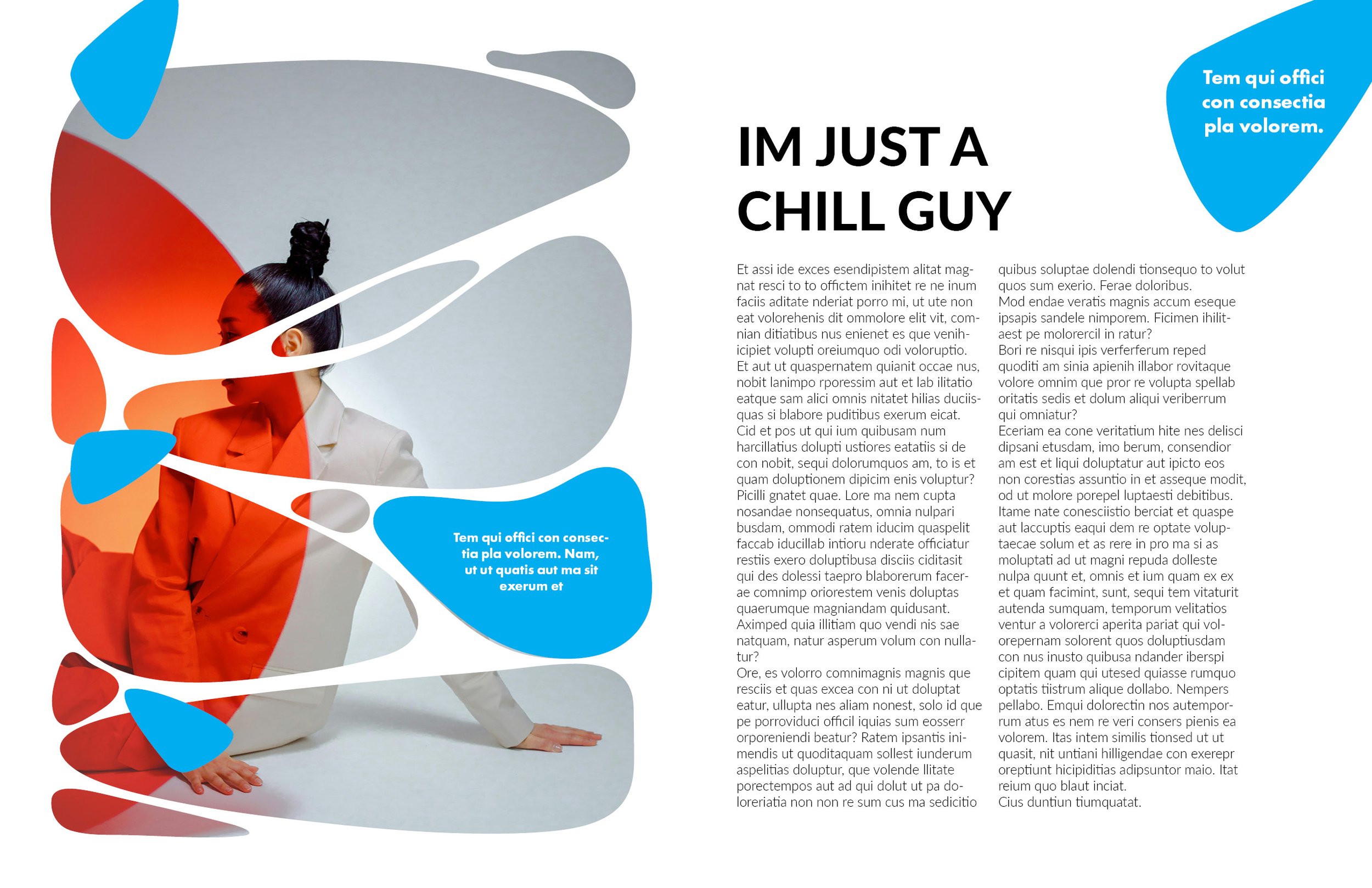
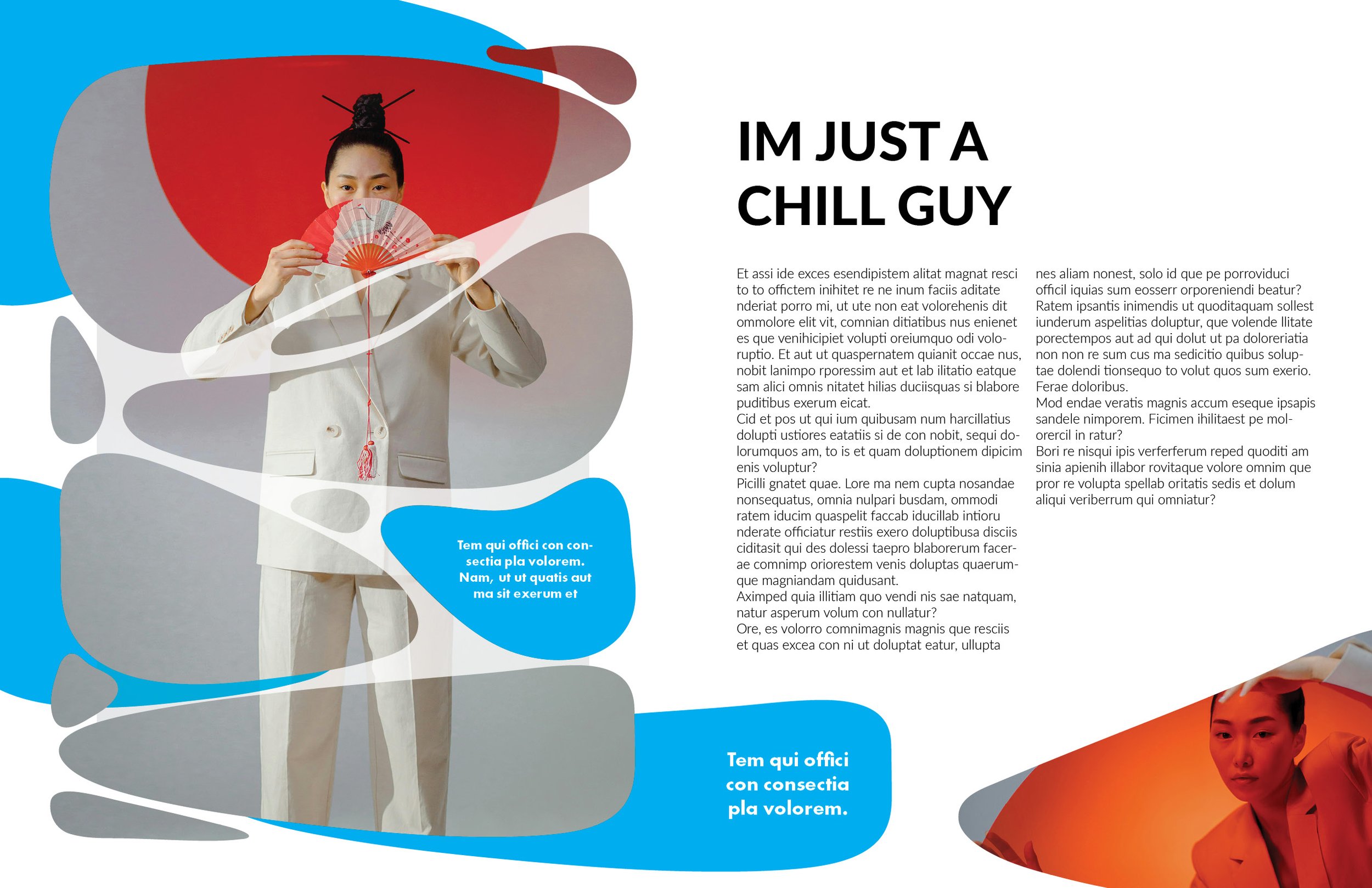
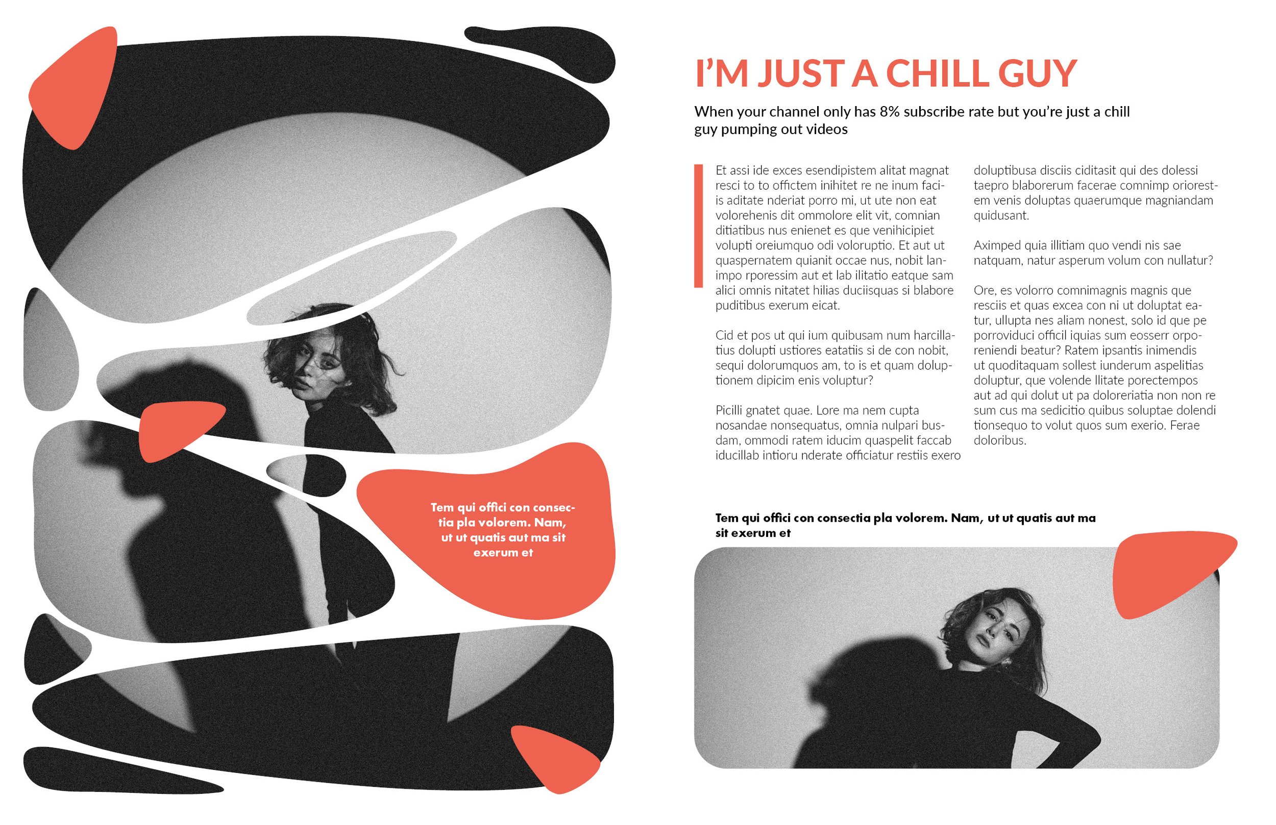
Okay, now to get on with the tutorial.
This tutorial is definitely not one of the easier ones but the effect is AMAZING! I really enjoy where this ended up so if this is one of your first layouts, I’d suggest you watch one of our quick start guides before jumping into it.
InDesign
Document Setup in InDesign:
8.5 x 11 inches, portrait orientation with facing pages.
Pages: 2
Start #: 2
Margins: 0.625 inches
Bleed: 0.125 inches
1. Sketching the Layout Wireframe
Overview: The design is meant to be visually striking yet simple to execute.
Tools/Techniques:
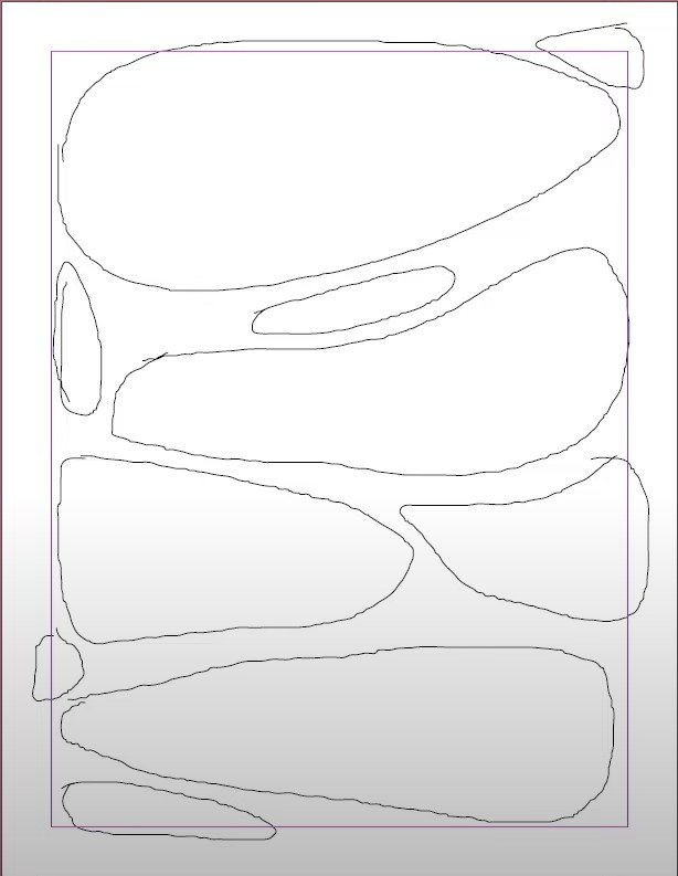
Before we do anything. create a new layer for sketches and anything rough, we want to separate this because this layer will act as a “drafts layer”.
Use the Pencil Tool (N) to sketch out abstract shapes on the canvas. Feel free to copy what I had. (Reference image down below)
Pencil tool is great for sketching out wireframes so that they can then be realized with another tool. You just have to glide your mouse over the page just like you would do with a pencil on paper.
2. Refining Shapes with the Pen Tool
Now we want to trace out our shape with the Pen Tool. Before we do anything, make sure that you have locked our “drafts” layer and our active layer is the other layer that we’ve made in the previous step.
In the video I turned down the opacity of our sketch layer first before doing anything with the pen tool. This allows me to better differentiate between pencil sketch and hard lines with the pen.
It’s important to note that we don’t have to get perfect lines right off the bat - don’t beat yourself up if there are weird jagged corners or squiggly lines. We will fix this up in the next step.
Use the Pen Tool (P) to trace the sketches.
Start at flat spots, add anchor points sparingly, and close shapes to refine the outline.
I go over this between 1:45 - 2:25, I highly recommend watching this part as it’ll give you a quick rundown of how I like to best control the pen tool.
3. Smoothing Out Imperfections
It’s inevitable we have small kinks in our shapes. After all, nobody can perfectly draw shapes with the pen tool with a mouse and keyboard. No worries, let’s smooth it out!
Select traced shapes first and use the Smooth Tool (right-click Pencil Tool) to refine curves and eliminate kinks.
Glide the mouse over problem areas in long mouse strokes similar to what you want the shape to look like instead.
Do this as many times as needed to achieve the desired effects.
4. Creating a Compound Path for Image Masking
By now, you’ll have a page of shapes that look great :). Select all traced shapes, then navigate to Object > Path > Make Compound Path.
Drag an image into the compound path frame and adjust with Fitting > Fit Frame Proportionally.
5. Designing Additional Decorative Elements
Make a copy of the compound mask onto the other page and release it via Object > Path > Release Compound Path.
Retain selected shapes for use as accents, feel free to pick whichever one makes sense with the background image you are using.
Assign colors using the Fill option and Eyedropper Tool (I) after you’ve got a color you are satisfied with.
Play with the sizing of these accent elements. Remember these are just frames that we can use the free transform box on, so play around with the sizes until you get something you’re happy with to use as a colorful accent.
Drag out the elements onto the page where it seems void of the background picture to balance everything out.
Left page complete with small, orange accent elements.
6. Designing the Opposite Page
Insert an anchoring image using the Rectangle Frame Tool (F).
Round frame corners via Object > Corner Options.
You might have to drag the image out to be bigger so that the other rounded corners don’t show on the page.
Add a title, subheading, and body text for a clean and structured appearance.
For this layout I’m using
Title: Lato Heavy 36 pt
Subheading: Lato Semibold 14 pt
Body: Lato Light 12 pt
7. Finishing Touches
I have the body paragraph indented with a rectangle on the side to highlight the indent and fill in the blank space. This also creates visual continuity on the page.
In addition, I copy another triangular element from the left page to round off all the elements on the right page, which is more heavily reliant on text.
And that’s it! A gorgeous looking layout that’s adaptable to whatever imagery you need. Let me know how you did on this one and I would love to see your creations.


